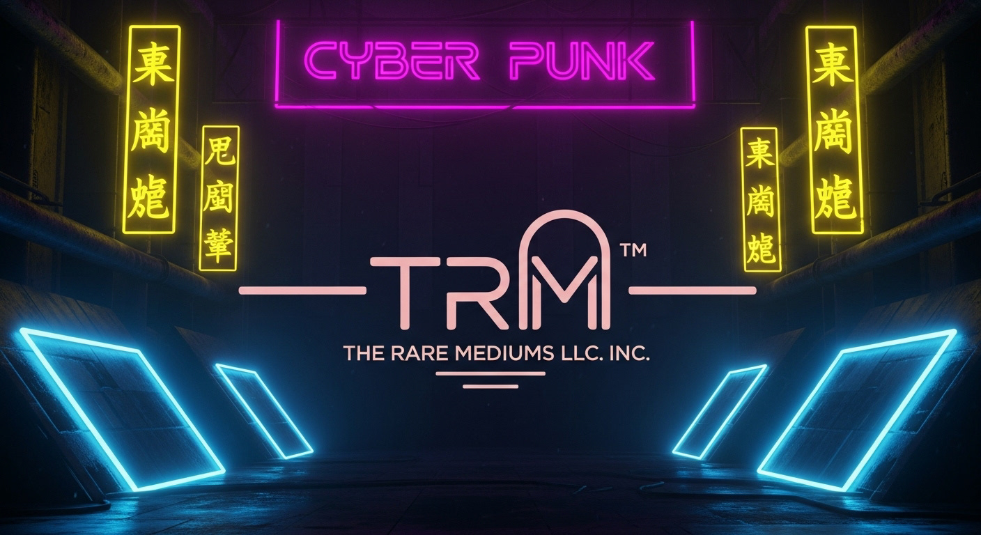
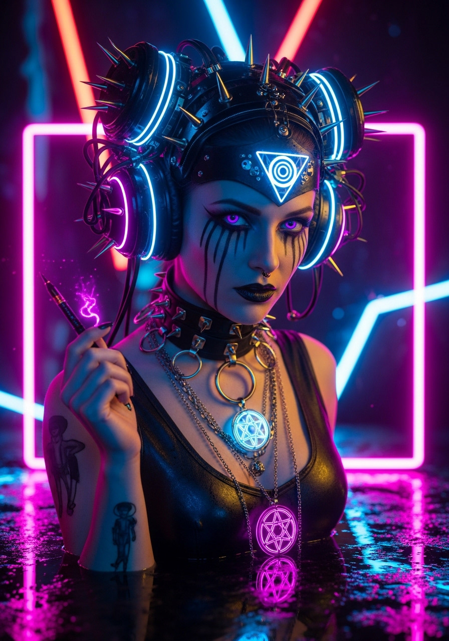
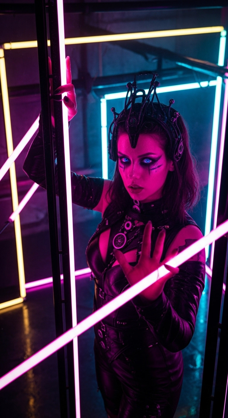
Shades, Tones, Hues and Gradients
The use of color in Digital Graphic Media Production.
The intelligent use of color in advertising and sales has been a fundamental tool plied by content creators, creative marketers and producers of every type of medium within the realm of graphic media since the early days of print advertising.
The Study of how certain colors cause the average brain to react, both in the conscious and subconscious mind, is a social science applied to everything from fashion design to uniform selection for franchised sports teams.
Understanding how the application of color and light (or shadow) can affect a persons general disposition, not just relating to your product or service but also how they feel about themselves and the day at hand. Colors and lights, applied with know how and intention, can have a very profound effect on the individuals all around perception and interpretation.
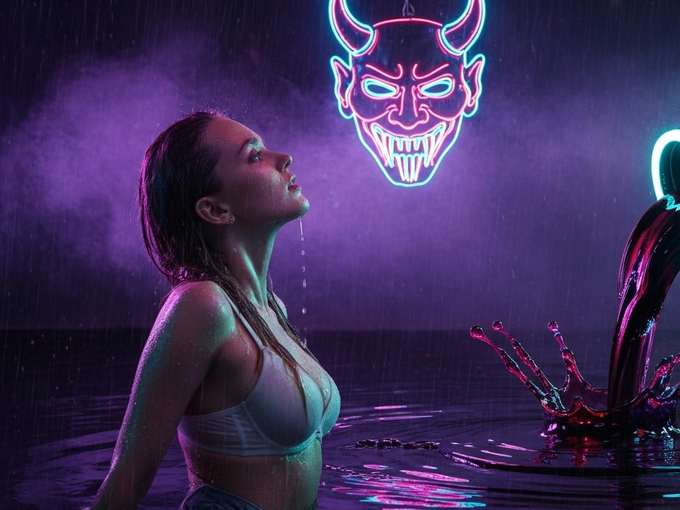
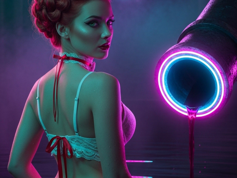
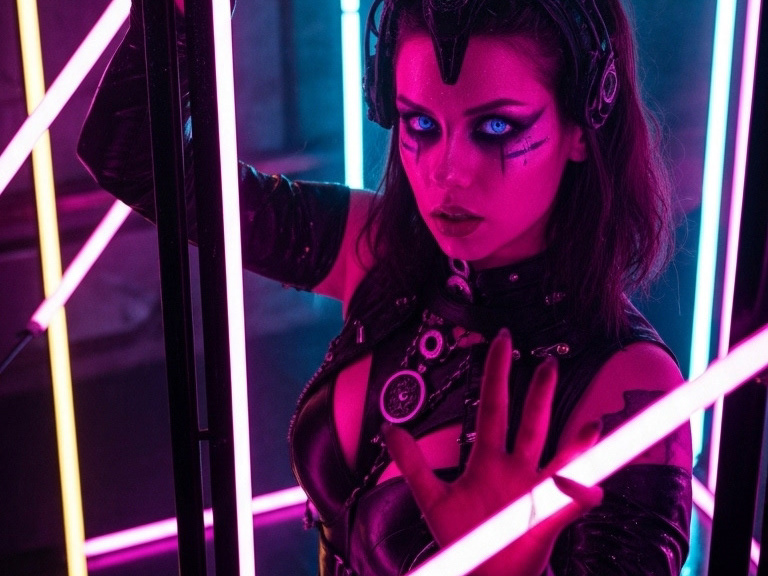
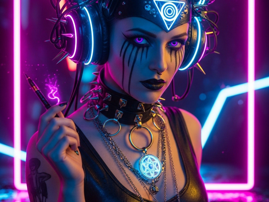
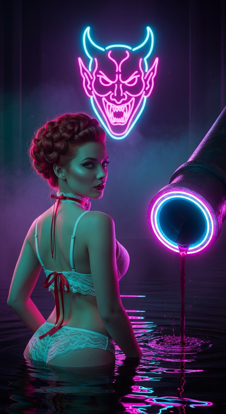
Not only is it true for very basic reactive causality in relation to colors effect on the individual, like in the case off the police officer who finds himself pulling over three times as many red cars as any other color vehicle in the run of a standard month. Which, if you look into it, is a doubly reactive solicitation on the part of the color red. Firstly, individuals who are more likely to want to drive fast, or who are more prone to driving faster than the norm, will more often than not purchase red vehicles when given the option. What's more, authorities running spot checks are more likely to have their attention drawn by the sight of a red vehicle passing by their speed trap than a white or a blue one. It simply stands out more. Also, subconsciously, the color red is a call to action in the more primal parts of the brain, speaking to the color of blood, fire and what's more the brain equates red with sex, which is also a call to action in the primal brain. When aroused the average person may become flush, their cheeks may turn a shade of red. A woman may wear bright red lipstick to accentuate her mouth in an effort to draw sexual attention from another, and the majority of the places on the body that the average person thinks of when they think about sex are most often some shade of red or another.
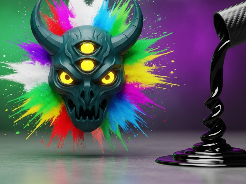
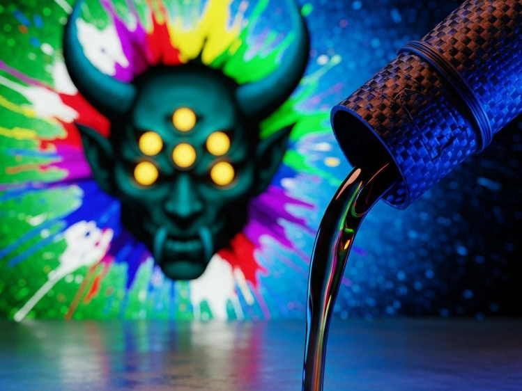
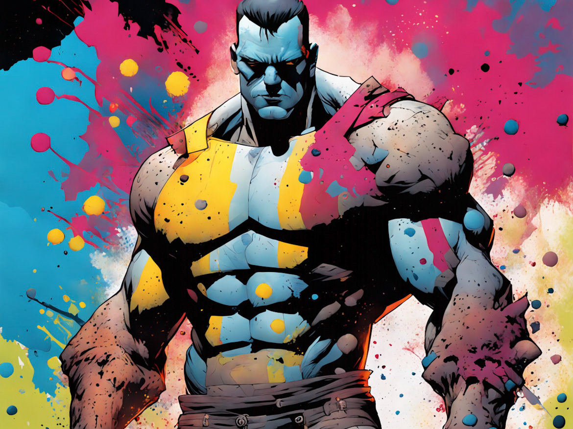
All of this works towards a very strong visual signal in the color red, and all of its hues and shades, that speaks to being a very useful color when your intention is to stimulate excitement, arousal, and any basic call to action through you graphic asset.
Of course this is just one example. There is base definition for reflexive response attributed to all colors in the primary color family which simply blends the various elements of the responsive nature of each color in percentage along a similar line that you would use to blend the actual colors together to create your new tone.
So if red is arousal and yellow is relaxation or bliss, attributed to images of the sun, warmth, yellow sand on a beach and other images churned up in connection to the bright, shiny color, then when you bring them together to create orange you have a slightly contradictory hue in some ways but in others a very complimentary one. This entirely depends on the content that it is applied to.
Orange works very well if you want to entice someone to take a family vacation, or if you are joining a new gym, but used to try and sell someone a new home, it falters, as red is not usually the sort of energy someone looks for in a home, maybe a hotel, but not a place to raise their children.
It would take upwards of 15 or so chapters, each detailing fundamental aspects of the use and application of colors, and color combinations, in digital graphic marketing and direct sales and advertising in order to properly educate you to the point where you should be able to take what you know and apply it to any of your future projects. And what's more, use that knowledge and the future experience to evolve your intellect on the subject to become more and more effective in your use of this social science.
Unfortunately I am not writing a book at present. But luckily for us I have not only already read that book, but I have had years of experience to learn it through trial and error and evolve it into a school of thought that I have made all my own.
With this in mind, if you would like to work with an expert in this field and many others related to it within the realm of digital direct graphic media production then all you need to do is contact me.
I Accept between 2 and 6 jobs each year, depending on the workload and the commitment required to finish the job to the satisfaction of all parties. This means that I only work with one client at a time, and during that time I don't even consider any other business.
If you contract me the term will most likely be remote, with frequent updates, emails, face to face meeting via chat or voice, phone calls and whatever else you might require to feel confident in the outcome of your project.
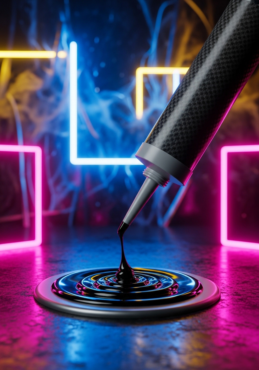
Of Course there is more to all of this than just color and light, radiance, shade, gradient, grey scale, and the various artistic techniques applied to producing graphic media. Of course the color scheme is the overture that sets the tone for the rest of your work, but the style, fonts, imagery, copy, medium and all the rest are going to have to all come together on a perfect cohesive element in order for your work to be everything you need it to.
If you would like to learn more feel free to check out the rest of the galleries.